
Led the redesign of Ruggable’s New User homepage experience, increasing conversion by 17% and total revenue per visitor by 9.6%
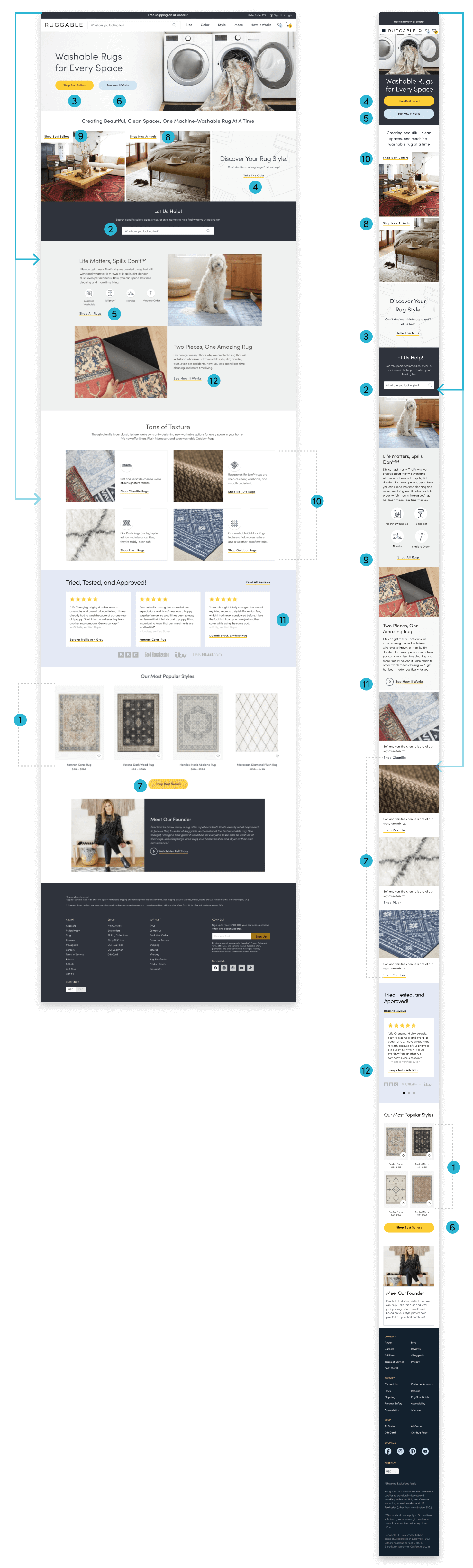
New User Homepage
ux design @ RuggableroleUX Design Lead
ToolsFigma, Heap, Optimizely
teamUX Designer,Product Manager, Engineer
TimelineDesign - 2 weeks, Development - 2 weeks , Testing - 2 weeks
introMeet the “New User”
Ruggable is an e-commerce company that designs and manufactures machine washable rugs. The company leverages customer segmentation to create personalized experiences. This also allows us to run experiments live on the website and collect data on customer behavior.
We know that first-time visitors behave differently than returning visitors, and should be treated accordingly. Customers who have never visited the site or with no browsing history are directed to a unique homepage experience - the “New User” homepage. This experience is designed specifically for first-time visitors and prioritizes educating new customers about our products.
GoalImprove existing homepage experience for first-time visitors?
key research insightsIdentifying Missed Opportunities
I turned to Heap, a digital analytics platform, to track customer behavior on the website, and pull data specific to the new user segment. The first thing we wanted to understand was what percent of the page visitors were actually seeing. This would help us identify the most valuable real estate on the page, as well as provide context on specific behavior that led to conversion (which sections were performing best.)
65% of visitors completed a scroll depth grater than 25% of page.
Less than 2% of visitors reached a scroll depth grater than 50%
Product Row on both desktop and mobile had highest conversation rates on page, despite being placed at the bottom of the page
Mixed results on Collection Block CTAs on both desktop and mobile. “Take the Quiz” preformed well, while “Shop Best Sellers” & “Shop New Arrivals” preformed poorly.
“See How it Works” CTA saw the lowest engagement on desktop
Reframing the problemHow do we effectively and efficiently introduce new users to the product (while maximizing content in the top 25% of the page) and increase conversion.
DESIGN DIRECTIONRefocus, Restructure & Redesign
Since the goal of this homepage experience was to educate the new customers, I wanted to focus on improving three key sections, Collection Blocks (Best Sellers & New Arrivals), Value Props & How It Works Section, Texture Section. All three were placed within the top 50% of the page and were producing some of the lowest conversion rates.
Value Props + How It Works


Goal: Educate & Discover
Performance: Poor
Opportunities:
Re-title - “textures” may be unclear to new customers
Higher page placement
Create scalable UI/UX that can support additional product types
Collection Blocks

Goal: Discover
Performance: Poor
Opportunities:
Replace Best Sellers Block with Shop-able product row (product row has highest CVR)
New UX for promoting New Arrivals - place to highlight new collections or product launches that might be featured on HP hero banner.
Relocate “Take the Quiz” CTA
Goal: Educate
Performance: Fair - Poor
Opportunities:
Condense and consolidate copy
Relocate “Shop All Rugs” CTA
Integrate HIW content into the page that does not require a click
Textures Section

exploration: Collection Cards
exploration: featured section
exploration: in contextDEFINING THE NEW EXPERIENCEReusable and Scalable Components.
I kept these themes in mind while sketching new concepts for this page. I wanted to try and reuse as many existing components as possible. Not only would this reduce development efforts, but it would also help establish familiar patterns for the customer and increase continuity between homepage experiences.

Featured Section
I looked to our interested user homepage and other landing pages across the site and noticed different variants of the featured section were being used frequently. This module could support both static images and video files, and flexibility to add text and icons.
Collection Cards
When designing the Collection Cards, I wanted to create a module that would not only provide a solution on the New User Homepage, but also be beneficial to other landing pages across the site. I proposed two variations for maximum flexibility.

Final MockupEducate, Discover & Inspire (to shop)
My goal was to design an experience that would educate first-time visitors about Ruggbale, help them discover multiple ways to shop, and ultimately inspire them to purchase. Below is a look at the final build. You can also view the re-branded version of my design (from private browsing mode) on Ruggable.com

LaunchImplementation & Testing
Our team ran a multivariate test using Optimizely, to compare the original design against two variations of the new design (see A. B. & C. below.) We ran the test for two weeks, in order to determine which variation performed the best out of all of the possible designs.


A - EXISTINGB - Product tpye C - Curated collections IMPACTResults & Next Steps
The test revealed that out of all 3 variants - option B performed the best - increasing page engagement by 17% and increasing RPV (revenue per visitor) by 9.6%. We were also able to see how each redesigned section performed in comparison to the existing design. The test showed that all redesigned sections out performed the existing, with the most notable improvements being the textures section (new collection cards) +97% increase in conversion and the new arrival block with a +79.8% increase in conversion.
+17% CVR
(entire page)+9.6% RPV
(entire page)+97% CVR
(Texture Section)+79.8% CVR
(new arrivals section)