Rebuilding A Design System
Built and maintained a (re)branded design system from the ground up to unify teams on a common design language for Ruggable’s e-commerce environment.

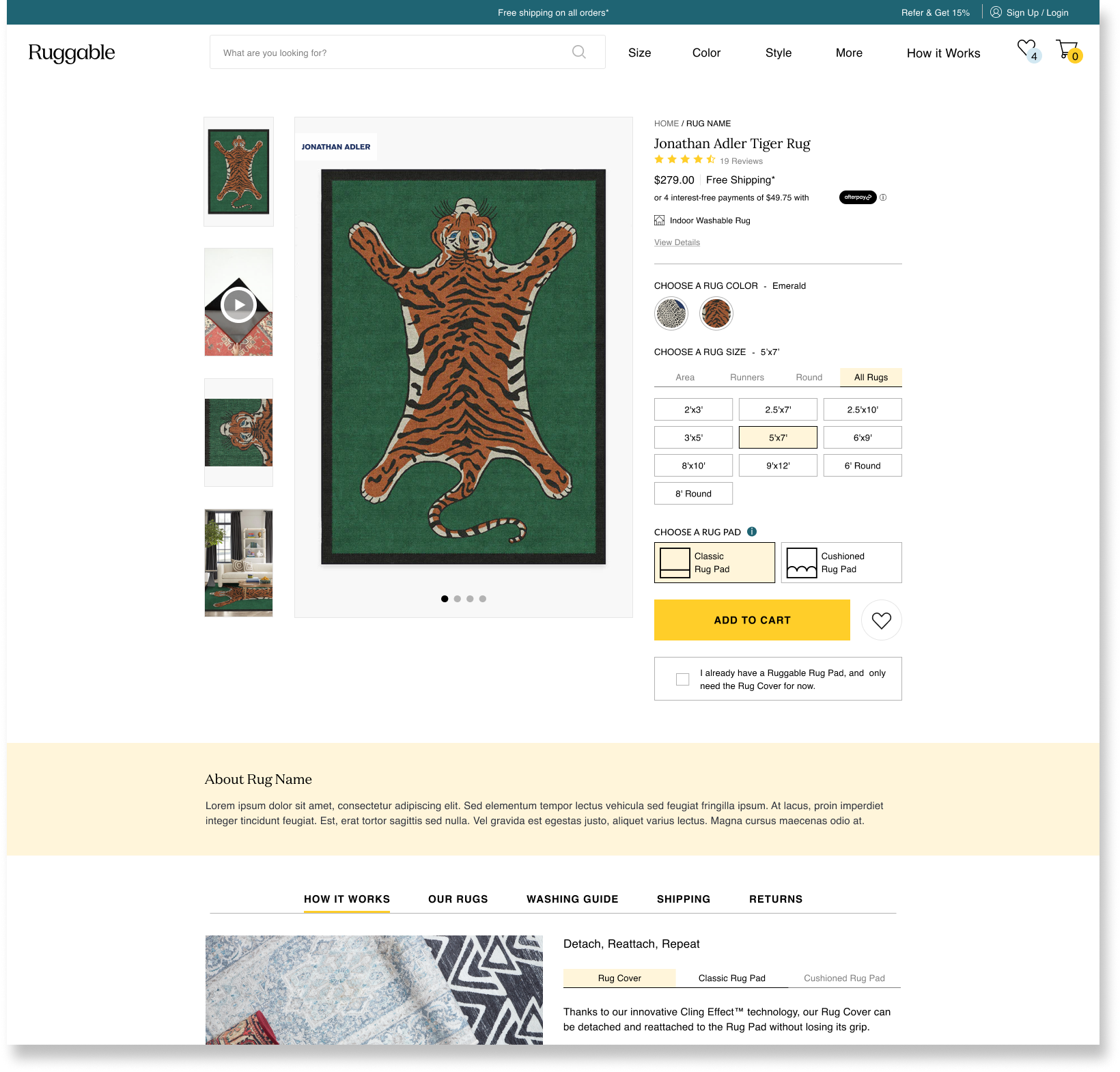
Ruggable Design SystemroleUX/UI Design, Documentation, Accessibility
ToolsFigma, Confluence, Contentful
team3 UX Designers, 2 Product Manager, 3 Engineers
Timeline2 months
introRebranding and Rebuilding
Until 2021, Ruggable lacked any type of formalized design system. The UX, product, and engineering teams had no shared foundation for brand standards or design language, resulting in major inefficiencies in the process and inconsistencies across the site. With ambitious goals slated for the coming year, it was clear having a scalable design system in place was long overdue.
The company was preparing for a rebrand, which meant the entire site would need to be updated with the new branding standards. This felt like the perfect time to start fresh and rebuild our design system from the ground up.
The ProblemDisconnected User Experience
The UX, product and engineering teams lacked any type of centralized foundation for UI standards and design language, resulting in major inefficiencies in our team's process and inconsistencies across our product.
Current State:
Conflicting guidelines and direction.
Duplication of common components and patterns.
Inconsistencies across the website.
Lack of documentation around process and design standards
GoalCreate a source of truth
A Design System is a systematic approach to product development that includes a complete set of design standards (style guide), components, and code. A good design system should include everything designers and developers need to build and scale digital products. .
Project Goals
Align our teams with a more structured and guided way to build products within our CMS.
Optimize design and development process with a ready-made library of components, modules and templates create layouts much faster.
Improve the e-commerce website across all devices by creating a consistent visual language
Team Structure
UX: Responsible for initial audit of current site, organize and refine existing elements and update in rebranded styles, create new solution for missing pieces, incorporate new branding, and run accessibility testing.
PM: Responsible for overall organization and facilitation of the project; creating documentation in confluence.
Engineering: Standardizing code across the design system and build out designs in our content management system.
key research insightsTaking Inventory
To better understand the current state of our existing design system, we conducted an audit of our current site - taking inventory of all UI elements including, typography, buttons, icons, input forms, layouts, etc. We compiled examples into a shared document which allowed the team to easily identify any overlaps, and eliminate outliers from our style guide.
In addition to implementing the new branding the company was also preparing for a migration to a new headless CMS. In consideration of our engineering resources, our team was asked to prioritize 20-30 content managed designs. We needed to take inventory of both common and unique patterns, and identify opportunities for consolidation.
Result from Style Inventory
100+ colors outside of style guide
50+ fonts sizes, with inconsistent use cases
15+ instances of inconsistent styling of common UI elements
Dozens of sections w/ slight variations in design
DESIGN DIRECTIONDesign System Structure
The diagram below shows how we structured our design system, which also became the roadmap for our process.

Foundations
Critical to the success of the system was the alignment of all our teams on the foundational elements. We documented the following; Color palettes, typography scales, grid definitions, and assets, which included; buttons, interactive language, logos, icons, and simple UI.
After refining and organizing our current branding’s foundational elements we needed to update each element with the new visual direction of the brand (New Fonts, Colors, and Logo.) Moving forward, everything we built would be designed to the new branding guidelines.


Patterns
Patterns are used to show reusable combinations of smaller elements that address common user objectives and help establish a common design language across the site.
Elements, Components, & Modules
Now that the foundation of our design system had been established, we could begin working on our component library, starting with simple UI and working our way out to more evolved and complex components. Our team prioritized and designed 30 new reusable modules that would be built in Contentful.

Templates
Templates are complete layouts and wireframes which include atoms, molecules, and organisms, essentially a skeleton webpage. By creating page templates, our team would be able quickly create new pages for product launches, collection launches and international expansions. We created templates for our most common page types for desktop, tablet, and mobile. Templates included Homepage, Pillar Page, Landing Page (Product), Landing Page (Collection), Product List Page, Product Details Page.


Rules & Documentation
Our team knew the success and sustainability of the design system depended largely on documentation and governance. Working in collaboration with our product managers and design guide pod engineers–our team created documentation resources in Confluence, outlining design standards and brand guidelines.
IMPACTResults & Next Steps
In a two month time frame, our 3 person design team created and organized a robust, adaptable, and fully rebranded style guide and component library. This work set the larger e-com team up for success, as we spent the next 10 months working hand in hand with our product managers and engineers to rebuild a large portion of the site for our CMS, Contentful.
Our combined efforts reduced design and development time for page creation time by 90% - allowing us to get new products and collections to market sooner than ever before.